Painting Perceptions of Identity

|
Overview:
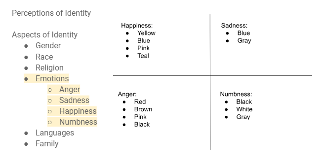
Title: Emotions of one Size: 60.96cm x 60.96cm Medium: Acrylic Paint Date of Completion: November 2022 Exhibition text: This painting that I have created is one inspired by Andy Warhol. Each quadrant of the painting represents a different emotion that someone feels. The emotions represented are happy, numb, sadness, and anger. I purposefully did not include faces because I wanted it to represent anybody, not just one specific person. Therefore it is more relatable to everyone. Since this piece is supposed to be a perception of identity, I thought that emotions are a strong part of someone’s identity and how they are perceived by people. |
Inspiration: Andy Warhol
|

|
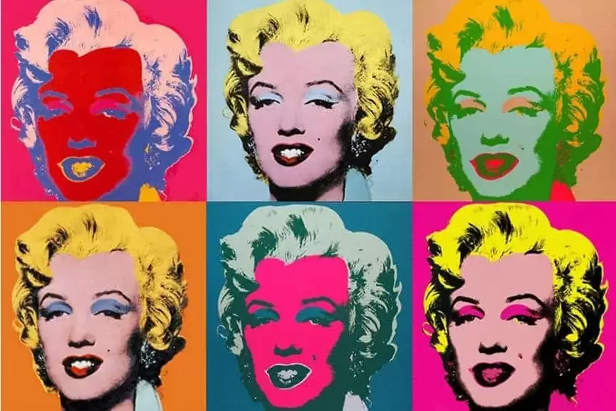
I was inspired by the artworks of Andy Warhol, a pop art painter. For my piece I wanted to have four quadrants, each representing a different emotion that we face. I immediately thought of the works of Andy Warhol. I was inspired by how he uses the same images but switches the color palette for each section. I decided that for my piece I would use the same image but switch the color palette, similar to Warhol. I liked how Warhol was able to maximize the amount of detail in each section, while also maintaining a simplistic form. The color in his works are what make his pieces pop. I also wanted this to be the case for mine.
Planning
|
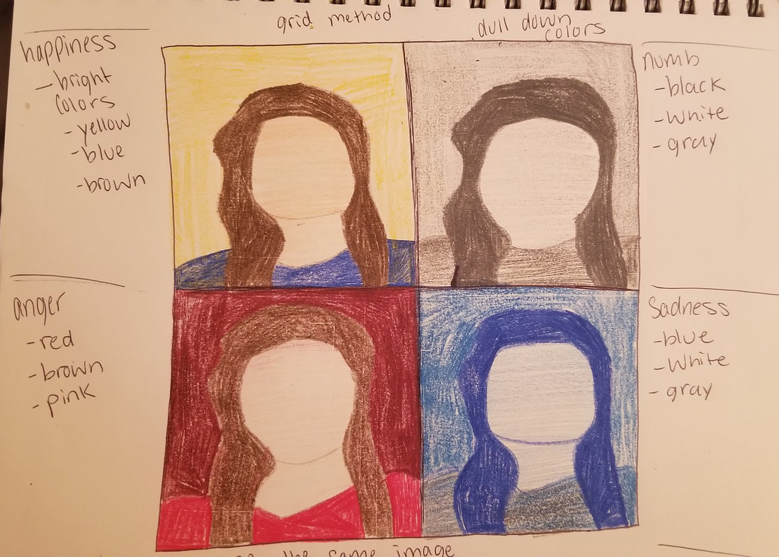
The first step in my planning phase was to fingure out what theme I wanted to go with. Since the painting is perception of identity, I decided that I would do it on the emotions that someone feels. The emotions that people feel often influence their personality and how people percieve them. I brainstormed which emotions I would choose to portray in the painting. Since I was doing four paintings in one, I decided to use Andy Warhol as my inspiration. The emotions and feelings I decide to use were happiness, numbness, sadness, and anger.
|
|
The first sketch I did was to have a picture of me in the center of the canvas. Then I would paint the left side of the canvas in bright, vivid colors. The right side of the canvas would be painted purely in black and white. This would show different sides of someone's personality. I later scratched this idea because I thought it did not have a strong enough meaning behind it, and woud not challenge me enough.
|

|

|
I did a rought sketch of the figure that I would use in all four of the quadrants on the canvas. I decided on just a simple figure of a woman. I used color pencils to help represent the colors I would use to demonstrate each emotion I would be incorporating. I was very happy with how this sketch turned out and decided that this would be my final sketch.
|
Process
|
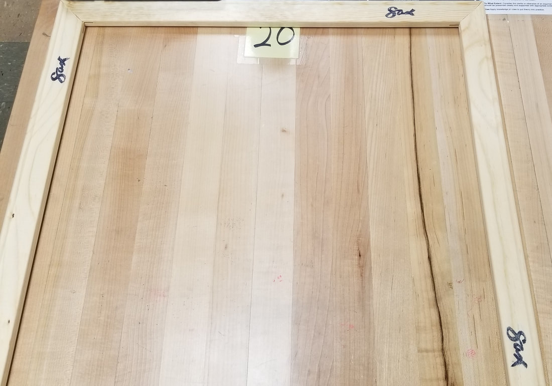
The first step in the process was to stretch my canvas. Using the wooden planks to the right, I stretched the canvas. After I stretched the canvas, I split the canvas into the four quadrants. I then split each quadrant into smaller squares. This would allow me to make each quadrant look the same.
|

|

|
The next thing I did was paint the first quadrant of the canvas, the top left. I used shades of yellow to paint the background, using the large flat brush. Then using, a medium sized flat brush, I painted the hair. I did this by mixing black and brown. I then mized together red, yellow, and white in order to make the skin tone color. I painted that color onto the face and used a slightly darker shade to create the contour. Lastly I mixed together blue, black, and white. I used that color for the shirt.
|
|
Next, I painted the second quadrant of the canvas, the top right. I used shades of gray to paint the background, again using the large flat brush. Then I used the large sized flat brush, and I painted the hair. I did this by using the black paint. I then mixed together black and white to make the skin tone color. This would fulfill the color palette. I painted that color onto the face and used a darker shade to create the contour and a lighter shade for the highlights. Lastly I mixed together the gray shade that I used for the face and black. I used that color for the shirt. This completely fulfilled the color palette of white to black. |

|

|
Next it was time for me to move onto the bottom left quadrant of the canvas. This section represents the feeling of anger. I mixed together multiple shades of red for the background. I wanted the multiple shades to be present in the background. Then i mixed red with black to create a redish brown color. I used the medium flat brush to paint the hair using the red-brown color. I added white to color I used for the background in order to paint the face. I used the medium flat brush to lay down the color for the face. The I used a round 10 brush to add the darker shade to the face. This shading helps to create the expression of anger. Lastly I mixed red with a drop of black in order to make the color for the shirt. Again, using the round 10 I painting the shirt and added texture.
|
|
The last section of the painting is the one tha represesnts sadnes. The color palette for this section are shades of blue and gray. Using the large flat brush I painted a mixter of blue and gray onto the background. The hair was painted with a mixture of blue and black. I took that color and added white to it to get the color of the shirt. Lastly I again added white to paint color. This is what gave me the color for the face. After all four quadrants were painted, I did last minute touchups. |

|
Experimentation

|
|

|
For this projects I did quite a bit of experimentation. The first instance of experimentation was experimenting with different sketches and planning ideas. I though about what would work best for me and what would accomplish my overall idea. The next area of experimentation came with picking colors. I threw together a few rough swatched in order to dertermine which color mixes would work best for which area. I mostly focused on the shades of blue, red, and yellow. Once I decided which color would work best then I just added white to them.
Critique

|

|

|
My piece in the center has many similarites and differences to the pieces of Andy Warhol that I used as inspiration. One of the most noticable similarities is that I divided my canvas into sections just like the inspirational piece on the left. I did this to help distiguish between the emotions that are presented. Another is the use of a singular figure in the center of each section. One of the differences is that the piece by Warhol has facial features. I wanted to leave the facial features out to help keep the piece simple but to also show that the emotions are universal to everyone. So I left the faces blank so that it doesn't look like one set person. Another difference is the colors. The colors in the Warhol piece are bright, vivid colors. The one's in mine are dull colors.
Reflection
Overall, I would say that this roject has helped me build up painting techniques and skill. This is by far the largest painting I have ever created, which was a challenge for me. I think the hardest part was getting all of the sections to look the same. The easiest part, I would say, was getting the colors how I wanted them to look. If I could redo this project I would definitely use my time better. It took me a while to come up with my ideas, which took time away from me actually getting to the painting part. Like I said before, I was able to build up technique and skill. I was able to see how the different brushed would help me with different aspects of the painting. Also there was blending involved, so I was able to better my blending skills. After completing this project, I would say that this has by far been my favorite project this semester.
ACT Questions
Clearly explain how you are able to identify the cause effect relationship between your inspiration and its effect on your artwork?
- There is a clear cause and effect between my inspiration and my art work. In Andy Warhol's painting he has the same image repeating, which I also have in my piece. I was inspired by his piece. Also the simplistic look of mine was inspired by how simple yet detailed Warhol's piece is.
- I think that the overall approach of the topic is using a range of colors to tell a story within the piece.
- I think that the main conclusion that I discovered is that certain colors are more appealing to some people. Whereas, artists sometimes tend to stay away from certain colors.
- The central theme around my research was identity and how also how people are perceived. I could ultimately tie this back to myself and the people around me. I think the key part of identity is emotions, so that is why I chose to focus on emotions that are present in people.
- I made the inference that Andy Warhol used the colors as a way to make the audience feel a certain type of way, instead of focusing on how it would look in the piece. I don’t know if this is actually what happened when he was creating his works.
Citations (MLA)
Ibrahim, Posted by Afzal, Afzal Ibrahim, About Afzal Ibrahim An Experimenter at Heart, About Afzal Ibrahim, An Experimenter at Heart, View All Posts by Afzal Ibrahim →, and The Artist Editorial. "Who's Andy Warhol? 7 Famous Andy Warhol Artworks." The Artist. 02 Apr. 2022. Web. 7 Dec. 2022.
Tutt'Art, Zana Bihiku. "Andy Warhol: Pop Art Painter." Pittura. 15 Nov. 2019. Web. 10 Dec. 2022.
Tutt'Art, Zana Bihiku. "Andy Warhol: Pop Art Painter." Pittura. 15 Nov. 2019. Web. 10 Dec. 2022.
