
|
Overview:
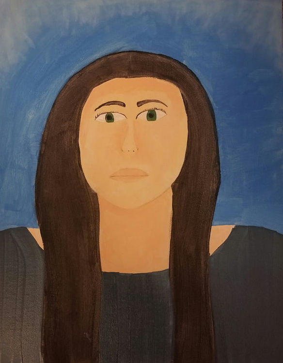
Title: Captured in Time Size: 45.5 cm x 35.5 cm Medium: Acrylic and Water paint Date of completion: September 2023 Exhibition text: Captured in Time is a self portrait that was created to represent the inspiration of Claude Monet and the impressionist movement. I was inspired by the light and some what ransparent colors along with the soft lines that come along with the impressionist movement as well as the works of impressionist painter, Claude Monet. |
Inspiration

|

|
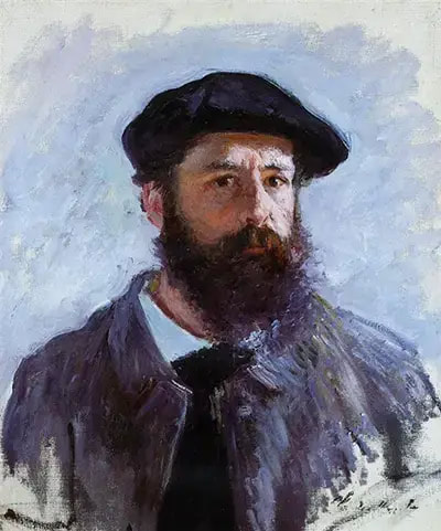
Claude Monet is one of the most well known impressionist painters. I have been familiar with him and his works for many years and have always found them to be inspirational. The main inspiration that I took away from his artworks are the skills and techniques that Monet has in the creation of his pieces. First I was inspired by his self portrait because of the light shades of colors that he used as well as the brushstrokes and the line work. In my piece I would like to be able to represent the colors that I will use in a very similar fashion. I also would like to incorporate the soft lines in certain aspects if my piece while also keeping it clean and uniform. I want to have a balance between the two whole also keeping my painting as realistic as I can. In my works I try to have a balance so that the viewer can understand what is being represented and I think that is what money tries to do as well.
Planning
|
The first planning sketch I did was a rough sketch of the figure that I would like to translate onto the canvas board. This was just a simple sketch that I did in order to plan out my ideas. I initially like to start with the broader ideas first before going into a specific sketch but with this project I had a vision that I needed to draw out first. While this is not my best sketch I tuink it was helpful on getting certain ideas out, such as shapes and colors because as seen in this photo, I did plan out what colors I initially planned on using for the painting. I knew I was inspires bu the blue background of Monets self portrait so I wanted to have that in my piece as well. So that is what I included in the sketch. The other colors are just general ideas that may change as I start painting.
|

|

|
The second planning phase was the planning out of more broad ideas. I knew that I wanted this piece to be inspired by the impressionist movement because of my familiarity with it and Monet. So I wrote down what makes the impressionist movement special. The attention to a light source, soft lines, light colors, and the capturing of reality are the key features of the impressionist movement that I wanted to focus on the most. I creade gradation scales if different colors to see how this could be used in my painting as well as practicing how to make hard vs soft lines.
|
Process

|
The first step in the process is to transfer a sketch onto the canvas board. For this specific prohect I decided that i wanted to outline thw basic shapes first and then as the process moves forward I will sketch ot more of the details. To get this sketch onto the board I did a freehand sketch inatead of doing grid squares or the transfer method that I had used on previous projects. With that being said I used a traditional pencil and sketched out the basic figure and made sure that it looked how I wanted it to before i darkened the lines and began painting. This step took a lot of trial and error but it was the most important step.
|
|
The second step of the process was to darken the outline shape and then to begin working on the background of the piece. As stated previously, I was inspired by how Monet portrayed his background with the nice soft blje. So I wanted to do that in my piece. In order to accomplish this I mixed blue paint with white paint and added some water to it to make it somewhat transparent so I could layer on the colors. I let the first layer dry and thwm I added the second later. Once the secoknd layer was dry I took some white laint and using the stipling method I added the white to the top edges to create a similar look to Monets piece. After I let that layer of paint dry I did a second coat of the white as well.
|

|

|
The next step was to do the hair. In order to do this I mixed black paint with brown paint. I used a square edged bruah and placed down a single layer of this color. I initially went through with a hard line around the outer edge of the hair and then went through and softened it. Once this layer was dry I went over it with a black and brown water color to create some texture that would be visible to a viewer. To create the texture I used a small fan brush which helped to manipulate the paint.Once I had the hair done, I moved onto the skin tone. For this i mixed my own skin tone color. I did this by mixing together white with yellow and a inch of red. Once I had that shade mixed, I split it into three cups. One was the original color, one i added white to in orser to create the highlight shade, and the other I added more yellow and red to create the darker shade. I layed down the original color to the face, the neck, and colorbone area. I then took the darker shade and added that to the hairline on the forehead. Later on in the process when I do the facial features is when I will use more of the differing shades.
|
|
Next is when I began to work on the facial features. This is where the small brushes come into play. I used the pencil to outline where the eyes, nose, and mouth would be. Once I had thos layed down where I wanted them to be, i began to paint. Using the same shade I used for the hair, i used a small brush to create the eyebrows and the eyelashes. I cleaned the small brush and used it to place the white in the eye and then the black. I mixed together a green shade that is also used for the eyes. Once the eyes were done I moved onto the nose. I used the darker skin tone shade to darken the outer edges of the nose and then used that same shade for the lips. I added more pink to lips however so they would pop more. Once all of the facial features were done, I went through and added mkre layers to certain aspects so they were thicker.
|

|

|
The last step was to make the color for the shirt. I was inspired by the shades of gray and blue that are seen in the two pieces I took inspiration from. So i wanted to do that for the shirt. I used what I had left of the color from the sky and added some black to it. This gave me the perfect blue/gray shade that I was hoping to get. I then used a large square brush and added two coats of the color so it was not as transparent. Once this was sone I went through and darkened any lines that I needed to and added more shading to corresponding areas.
|
Experimentation
|

|

|
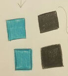
For the experimentation, I experimented with the selection of colors, the shades of colors and the brushstrokes in regards to soft edges. The first picture is where i experimented with the contrast of edges. I first saw how I could create a a sharp line by keeping a steady hand and applying pressure. I then lightened the pressure I applied in order to get softer edges for the second square of each color. The picture in the middle is a gradation scale of colors that I created by applying different levels of pressure. Lastly, the picture on the right is the color swatches that I used for the painting. Not all of these colors were used but this is where the experimentation for this project came from.
Critique
|
|
|
|
Similarities:
One of the main similarities is the color choices between my painting and the pieces of Monet. The shades of blue is something that I wanted to carry over into my piece because it helps to contrast the warm colors in the facial features and the dark color of the hair. The shades of blue in the sky is the main place that I wanted to emphasize the impressionist movement. I didn't want to make the lighter shade to prevelent because I didn't think it would fit very well with the overall piece and the message. Therefore, I kept the lighter shades subtle. |
Difference:
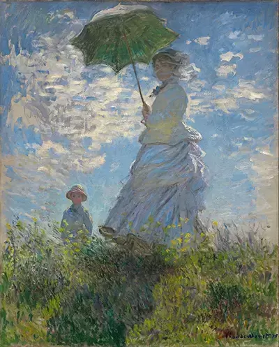
The distortion in the impressionist features of Monet's piece is not something that I wanted to carry into my piece because I wanted to keep mine having clean lines and very basic features. I intentionally kept the features of the painting simple because that is my preference in how I like to create my artworks. I am not a big fan of having every small detail in the piece like Monet has in both of the above piece. I kept the detailed brushstrokes in the background and intentionally kept simple shapes and elements for the rest of the piece. |
Reflection
This piece was one of the most important piece that I have made because it is one that connects back to the comparitive study. I needed to make sure that I was able to convey the necessary skills as well as convey the overall message of the piece. In this piece I wanted to once again convey the message of self expression and confidence. However, it was also important for me to also be able to show how the inspiration pieces have inspired me. The process of making this piece had definitely been one of the easiest ones for me because I intentionally kept it simple in form and line. My concern is that the viewer will not be able to know that the simplicity of the piece was intentional rather than lacking skill. That is wehre writing out the process was important for this specific project. If I were to redo this project I would convey the art movement more that I initially did however I think it is still visible to the viewer that the inspirational piece did have an effect on my work. Painting is something that I love to do in my freetime and I think all of my painting projects have been helping me build up my skill and the research has helped me in absorbing knowledge on different art movements and other artists that I have heard of and ones that I have not quite heard of yet. I learn more as I go.
ACT Questions
Clearly explain how you are able to identify the cause effect relationship between your inspiration and its effect on your artwork?
- I am able to identify the cause and effect relationship through the color selection and the line work that is in my piece in comparison to the inspiration pieces from Claude Monet.
What is the overall approach the author has regarding the topic of your inspiration?
- The overall approach is that art is a means to self expression and releasing emotions from past experiences.
What kind of generalizations and conclusions have you discovered about people, ideas, culture, etc. while you researched your inspiration?
- I concluded some general things from the impressionist movement such as the lighting, colors, brushstrokes, and meaning. I was able to better understand how these apects make the impressionist style unique.
What is the central idea or theme around your inspirational research?.
- The central theme around my research is self expression and identity.
What kind of inferences did you make while reading your research?
- One of the inferences that I initially made was that this kind of art is strictly about style and less about meaning, but I was very wrong.
MLA Citations
“Self Portrait with a Beret.” Self Portrait with a Beret by Claude Monet, www.monetpaintings.org/self-portrait-with-a-beret/. Accessed 21 Sept. 2023.
“Woman with Parasol.” Woman with Parasol by Claude Monet, www.monetpaintings.org/woman-with-parasol/.
“Woman with Parasol.” Woman with Parasol by Claude Monet, www.monetpaintings.org/woman-with-parasol/.
