Collage Painting

|
Overview:
Title: My Culture Size: 45.5 cm x 35.5 cm Medium: Acrylic Date of Completion: November 2023 Exhibition text: My Culture is a collage painting that I created to represent my Puerto Rican culture. This piece is inspired by the cultural aspects and meaning behind Frida Kahlo's Portrait of Frida's Family and Self Portrait along the boarder line between Mexico and the United States. This piece includes symbols and aspects related to my Puerto Rican culture and the place that my grandparents called home. |
Inspiration

|

|
My inspiration for this piece is Frida Kahlo. I have found many of her pieces to be inspiring to me throughout my other works. However, for this piece it is not for the same reason: visual appearance. This time I have taken inspiration from the meaning and messages from her two pieces. The first piece that I have taken inspiration from is “Self portrait along the boarder line between mexico and the united states.” In this piece Kahlo demonstrates her American side while also showing her Mexican side. For her, there is a very distinct difference between those two sides. For me, I have the American side and my Puerto Rican side mixed together. The symbolism in this piece is also something that I drew inspiration from. The representation of both the American flag and the Mexico flag, I think, was a great way to portray her two sides. As well as this, she depicts other symbols that represent America and some that represent her Mexican heritage. For my piece, it is heavily symbolic of my Puerto Rican side. The second piece that I took inspiration from was “Portrait of Frida’s Family.” This piece depicts members from Kahlo's family tree. To me, this painting shows how much family means to Kahlo and that she wanted to show that through a painting. While in my piece I won't have any people being presented, this piece will still show how much my family means to me. Three of my four grandparents were born in Puerto Rico and lived there for some time. While I have never actually been to Puerto Rico, I have learned so much about the beautiful island through my grandparents, reading about, and pictures. This is still a big part of my culture and my life even if I have not had those experiences firsthand. And I want to be able to represent my family’s culture through this piece.
Planning
|
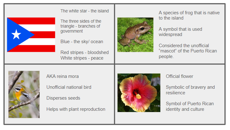
The first step in my planning phase was to determine which symbols I wanted to use for this piece. I did a lot of research and was able to compile this research into a chart. The first symbol is obviously going to be the Puerto Rican flag. There is a large significance to each aspect of the flag that I learned through my research. Firstly, the white star is representative of the island. The three sides of the triangle represent the three branches of government and the blue represents the sky and the ocean. Lastly, the red stripes are symbolic of the bloodshed and the white for liberty and peace. The next symbol in this collage painting is the spindalis, also known as reina mora, the unofficial national bird of Puerto rico. The spindalis is very important to the Puerto Rican environment because it disperses seeds and helps with plant reproduction, hence why it is the unofficial national bird. My next symbol is called flor de maga, which is also known as the Puerto Rican hibiscus. It is the official flower of Puerto Rico. It is said that this flower is symbolic of bravery and resilience and is an overall symbol of Puerto Rican identity and culture. Lastly, we have the coqui, which is a species of frog that is native to the island. It has become so important to Puerto Rican culture that it has become a symbol that is used widespread and is considered the unofficial “mascot” of the Puerto Rican people.
|
|
Once I knew what symbols I was going to use, I sketched each one out so that I could plan out the shapes, colors, and exactly where I wanted to put them on my painting. The first sketch I did was of the Puerto Rican flag. This is definitely going to be the easiest symbol to create for the painting because it is straight lines of a basic red and a basic blue. Getting the start to be perfect will probably be a challenge however. I decided that for the flag, I want it to be positioned covering the whole top of the board. I want that to be where people look first, so they know what the painting will be about just by looking at it. The next symbol I sketched out was the spindalis. This also has a somewhat easy form to recreate. I'm also going to add the stick for the bird to be perched on. This bird has very contrasting light and dark colors, so I need to make sure that the colors don't blend together too much. I need to make sure that the yellow and the orange are very bright and that the black is mixed with a slight hint of white so it is not pure black. I also need to make sure that I have all the details like the feet gripping the stick and the eye differentiating from the dark feathers. I know for this I will have to use smaller brushes to get the featherlike texture and the smaller details.
|

|

|
The next two sketches that I worked on were the coqui and the flor de maga. I started with writing out the significance of the coqui and then I started to work on the sketch for it. I started by sketching out the basic form and then started to figure out my color palette. I wanted it to look like a traditional coqui with the basic light brown color. I then decided that for the smaller details I would use a darker brown. I think I will try to mix together a shade of brown and green for the reflection of the water and maybe create a dirty appearance. I then thought about the placement of the coqui. I was going to have it just there but then I thought about putting it on a lilypad with water surrounding it. Then maybe add the flor de maga around this. So I decided that for the placement of the coqui, it would be in the middle of the painting but closer to the bottom. Next for the flor de maga, I decided to go with more traditional colors. They will mostly be a bright pink with bright yellow accents on the petals. I will use a darker red for the shading details closer to the center of the flower. I know I will need a small detail brush for the very fine details in the center of the flower and for the smaller details of the petals. Lastly for placement, I want the flowers to be around the water towards the bottom of the canvas.
|
Process
|
The first step was to sketch out the Puerto RIcan flag that is going to cover the top of the canvas board. I used a straightedge to get straight lines on the bottom of the flag as well as the stripes. I measured the side of the triangle that was on the edge of the board and made the other two sides of the triangle the same size. I did this because the actual flag has an equilateral triangle. Once I had the flag mapped out I started to go in with the red for the stripes. I used pure red and a large flat brush. I started by doing an initial coat that happened to be very streaky. With this initial coat, I wanted to make sure that the edges were as straight as they could be. There were a few places that got messed up so to correct this I used a wet brush and went over those places. This helped to remove the paint that went over the lines. Once the initial layer was dry I went over it another time with the same large flat brush. While I was working on the other components I repeatedly went through adding layers of red paint to the stripes so that it was a nice solid layer and not streaky. Once I had the red done, I cleaned the large brush very well so that when I went in with the white stripes there was no leftover red on the brush. I repeated the process that I did with the red stripes for the white stripes. I did three layers of the white so that it stood out from the red and helped to clean up the straight lines. I used a small, fine brush to go over the edges with both the red and the white so that I could make sure that the lines were extra straight. This process was done throughout the entirety of the painting process.
|

|

|
Once I had the stripes completed, I started to work on the triangle and the start. First, I used a medium sized flat brush to outline the edges of the triangle to create the nice straight lines. Once I had the edges outlined, I did the same thing for around the edges of the star. For this I used the same brush. After this I switched to a medium sized round brush for the inside of the triangle. I switched brushes because I felt that I had smoother strokes and less streakiness with the round brush. I used the same blue shade for the inside of the triangle and then let it dry. Once it was dry, I went over it with another layer. I then started to work on the star. For the star I used a small round brush because, again, it worked smoother and it allowed me to get the pointiness for the points on the star. It was hard for me at first to keep a steady hand when doing the point of the star but then I figured out that I had to change the way I was holding the brush. Once I changed the way I was holding it, I was able to keep a more steady hand. I went over this section with two more additional layers to get the white to stand out from the blue. I then used a fine brush with the blue paint to fix any corrections I needed to make to the outlining of the start because some parts got messed up when I was doing the white. But I was able to fix those areas with a layer of the blue paint.
|
|
After these steps I was happy with how the flag looked for the time being. I knew I would have to add more layers to the red and blue but at this time I needed to work on the other components. The next component that I wanted to work on was the long branch that I would have expanding from the left to the right side of the page. For this I challenged myself to create my own brown color even though I already had a brown bottle of paint. Once I had the brown color mixed together, I used a small flat brush to map out where the branch would be. The top of the branch was a pretty simple line but the bottom of the branch has another smaller branch coming off of it. I didn’t want this branch to just be a simple straight line so that is why I added this little branch to it. Once I had it mapped out, I filled it in with the brown color I had made. Similar to all of the other components thus far, I used multiple layers to limit the streakiness. I then decided to add some leaves around the branch on both sides. The image to the right shows the right side of the canvas, but this process was also done on the left side as well. I mixed together about five shades of green (a basic green, a light green, a yellow-green, a dark green, and a green-brown shade). Each of these shades were used for the leaves, whether it was for the actual leaves or the details on the leaves. For all of the leaves, I used the same medium sized round brush and just washed it in between doing each leaf. Once all of the leaves were dry, I went through with a small brush for the little details such as the veins and shading/highlights.
|

|

|
Once I finished working on the leaves, I decided that I wanted to start working on the flor de maga flowers and the water that was going to be around them. I began mixing my colors which included a bright pink, a pale pink, a dark pink, a dark red, brown, and a pale yellow. Once I had all of my colors mixed together, I started off by laying down the basic shape of the flower. I made four petals with all of them conjoining on the sides and meeting in the middle. While this was still wet, I added the yellow to the tops of each petal and blended the yellow and the pink together. After this, I used a small detail brush to add the highlights and shading to the petals, as seen in the picture. Now for the center of the flower I had to wait until the other parts were fully dry. Once they were dry, I added the brown shade to center of the flower. To create the effect of a real flower center, I added more layers as I went closer to the center, to darken it. I then let this layer dry before doing the last part. The last part was to finish up the center of the flower called the stamen. To do this, I took a small detail brush and added a line of red coming from the center. I used the same brush and added a line of white coming off of the red and blended it into the red. Once that was done I added the rest of the small details to the stamen.
` |
|
My next step was to add the water to the bottom section of the canvas board. I had mixed together a few shades of blue to test out which ones I had liked. Some of them were plain blue, other shades had some yellow, gren, or brown tints to them. This is where the experimentation comes into place. Once I had settles on my three favorite shades I began to paint the water. I wanted to make the water a simple as I could to mimic the actual waters of Puerto Rico which are very clear. So I took my medium sized flat brush and layed down the medium shade of blue. I had put this shade over the entire section of the water. While it was still wet I blended my light shade of blue to the section closest to the flag. I did my best to have a nice even blending to the two shades. I then blended the darker shade of blue into the section closest to the bottom of the board. Once I had let the entire section of blue dry I started to work on the coqui and lilypad. I sketched out the basic outline of the coqui in pencil and then mixed together my colors. For the actual coqui I made a light brown shade, as well as a darker brown for the details. I also mixed together a brownish green shade using my left over green from the leaves. I used a medium sized round brush and filled in the outlined shape with the light brown color. Once I let this dry, I went in with a small detail brush and the darker brown to create the leg folds, and the wrinkle lines. The last step was to add the eye and make place some stroked of the green shade over the already dry coqui.
|

|

|
By this time the paintings was almost complete. I just had to work on the finishing details and small corrections. I went over the small details of the flag again to make sure each line was straight and clean. Also, I went over the small details in the leave so they were noticeable but not too overpowering. And lastly, I went over the blending in the water. Once the water had dried before I noticed that it was not as blended as I would have liked it to be. So that is why I went over it again. After that, The painting was complete! |
Experimentation

|
My main focus for the experimentation was brush size, color selection, and blending. For brush size, I needed to know which size of brushes I could use for the different elements such as the water, flower, and leaves. So I used a blue shade that I had previously made and tested four sizes of brushes that I wasn’t too familiar with. I didn’t test the brushes that I already used in previous projects. So these ones were new to me. I also experimented when it came to finding the blues for the water. At first I wanted to mix the blue with a slight yellow, brown, or green, so I tested it out some little samples and was not a big fan of these different colors. So that is why I decided to go with a simple blue. The other ones made the water look dirty and that is far from what I wanted it to look like. Lastly I tested out my blending. I started by working on the blending for the leaves. So that consisted of the shades of greens and brown. I also practiced the blending of the yellow and the pink. I found that if I blend them while the layers were still wet it was easy to blend them out.
|
Critique

|

|

|
Typically for my projects I find inspiration for the physical aspects of the piece. However, for this project I took inspiration from the cultural representation of the two pieces above that were created by Frida Kahlo. The first piece is depicting the two sides of Kahlos culture, her Mexican side and the American aspects of her. This is culturally similar to mine because I obviously have my American side and my Puerto Rican side. The symbolism in her piece is helping to show both if those sides. Kahlo purposefully adds symbols that help to represent that side and are things that obviously relate. This is similar to mine because I also added the symbolic elements to my piece that help to represent my culture. The only difference is that her piece shows both of her cultures, whereas mine only focuses one. Her second piece is also fairly similar to my piece because her piece is representative of her family. Mine is as well. In her piece she actually adds he relatives in her painting. In mine I added the symbols of my culture to represent my family without actually showing them in the piece. This piece is highly symbolic of my cultural roots and my family. I was able to learn more about her pieces and see these differences and similarities. Whole they are not physically similar, the have very similar meanings to them.
Reflection
This painting is extremely personal to me. It is representative of my cultural identity and my family. Three of my four grandparents were born and raised in Puerto Rico and got to experience life there. Although I have never been to Puerto Rico, I can tell of how beautiful the island is from pictures and the stories that my grandparents have told me. I wanted to capture this beauty and significance in my art piece and hoped to make my grandparents proud in my depiction. A lot of research went into creating this piece because I needed to pick very important symbols that were also visually appealing. I think I was able to interpret what I had researched into a beautiful painting. This painting was definitely one of the hardest ones that I have created because of how meaningful it was to me. I needed to make sure that everything turned out perfect. It took a lot if time and a lot of effort, and there were many hard moments. But throught determination I was able to push throught. This painting is my favorite piece that I have created up to this point and I am extremely proud of myself for creating it.
ACT Questions
Clearly explain how you are able to identify the cause effect relationship between your inspiration and its effect on your artwork?
I am able to see a cause and effect relationship between my work and my inspiration through the similarities in the cultural context. Seeing how my inspiration was able to portray her culture helped me in portraying mine.
What is the overall approach the author has regarding the topic of your inspiration?
The overall approach my inspiration has is to portray aspects of her life in a way that gives a viewer access into her life.
What kind of generalizations and conclusions have you discovered about people, ideas, culture, etc. while you researched your inspiration?
I made the conclusion that every culture has it's own symbols that are important and help to show the importance of each culture.
What is the central idea or theme around your inspirational research?.
The central idea around my central idea is culture, and more specifically hispanic culture.
What kind of inferences did you make while reading your research?
As stated previously, I made the inference that each culture has their own symbols that are important to them.
MLA Citations
Portrait of Frida’s Family, 1950 - by Frida Kahlo, www.fridakahlo.org/portrait-of-frida-family.jsp. Accessed 21 Nov. 2023.
Self Portrait along the Boarder Line between Mexico and the United States - by Frida Kahlo, www.fridakahlo.org/self-portrait-along-the-boarder-line-between-mexico-and-the-united-states.jsp. Accessed 21 Nov. 2023.
Self Portrait along the Boarder Line between Mexico and the United States - by Frida Kahlo, www.fridakahlo.org/self-portrait-along-the-boarder-line-between-mexico-and-the-united-states.jsp. Accessed 21 Nov. 2023.
